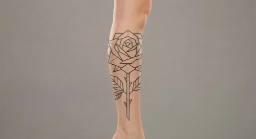
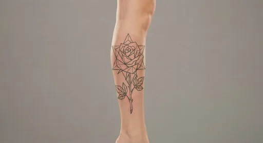
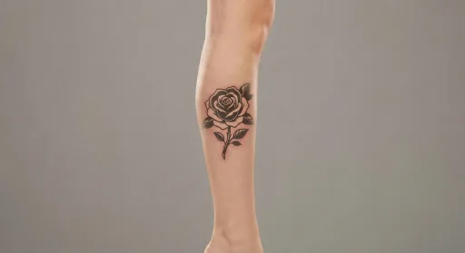
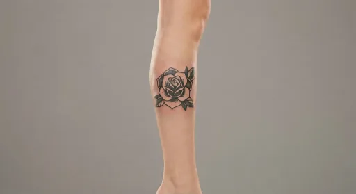
Design preview
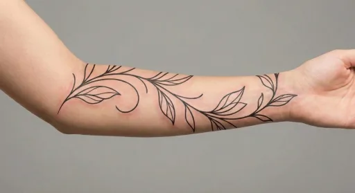
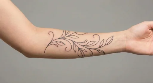
Fine Line Vine Leg Tattoo #2
Open spacing between leaves keeps the vine readable.
Best when the motif stays centered and readable.
- Placement
- Leg
- Style
- Fine line
- Motif
- Vine
- Typical size here
- Medium (8–14 cm)
- Visibility
- Moderate — easy to show or cover
- Line weight
- light
Download files for this design are not available yet. Save the preview and use the notes below when you brief an artist.
On the leg
Centered layouts tend to read best on the leg, especially when the design is elongated rather than wide. Consistent line weight and a clear axis keep the tattoo looking intentional from the front, side, or in motion.
Best when the motif stays centered and readable.
Fine line linework
Because the lines are thin, scale and spacing matter more than shading. Clean silhouettes, gentle arcs, and soft symmetry help the design read well from a few feet away without needing extra weight. This makes fine line a good fit for curated, placement-first layouts.
Avoid dense detail to keep the linework readable.
The vine motif
Thin stems and spaced leaves keep the vine airy and readable. Avoid packing too many leaves into a short area, and let the line guide the eye through the placement. This motif works well in fine line or ornamental styles.