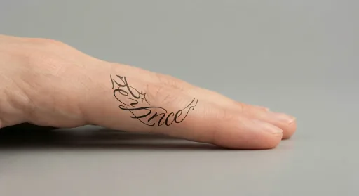
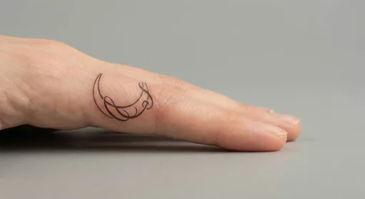
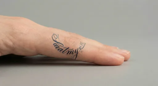
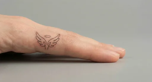
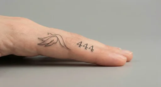
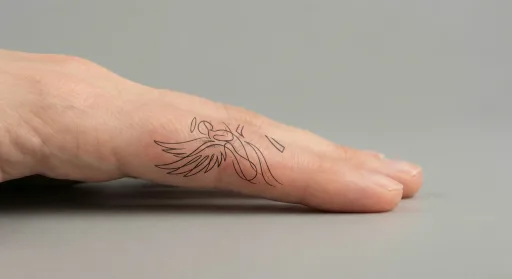
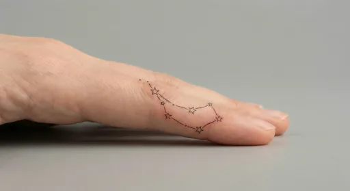
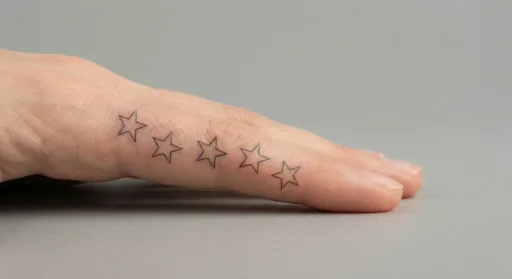
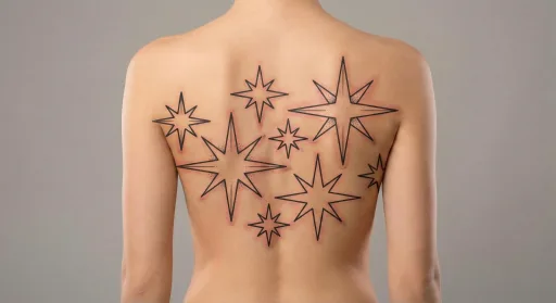
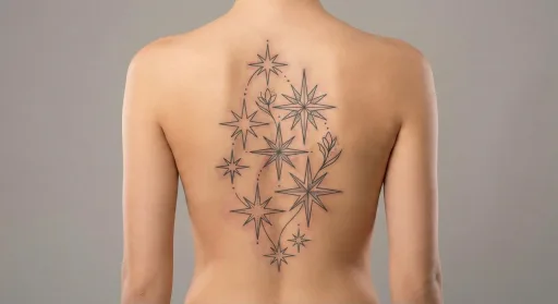
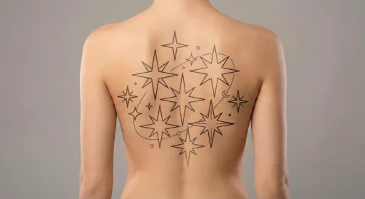
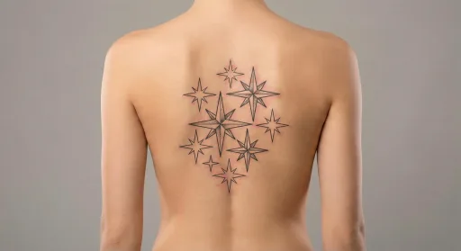
Design preview
Script Stars Finger Tattoo #9
Stars remain readable at small sizes when spacing is consistent.
Best for tiny, bold shapes.
- Placement
- Finger
- Style
- Script
- Motif
- Stars
- Typical size here
- Small (3–7 cm)
- Visibility
- High — hard to cover with everyday clothing
- Line weight
- light
Download files for this design are not available yet. Save the preview and use the notes below when you brief an artist.
On the finger
The best finger tattoos use short lines and small silhouettes that fit between joints. Dense shading or tight clusters can blur quickly, so an open layout helps the design stay crisp and recognizable.
Best for tiny, bold shapes.
Script linework
Short words or number sequences tend to work best, especially when the letters can stay clean and evenly spaced. A simple baseline and steady stroke weight help the script look intentional rather than crowded, even in smaller placements.
Keep letter spacing even for readability.
The stars motif
A single star stays crisp at small sizes, while a short cluster can add movement without overwhelming the placement. Use consistent spacing and avoid tiny overlapping points so the motif remains legible as it settles and heals.