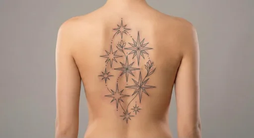
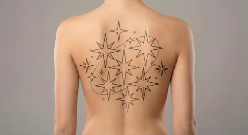
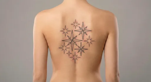
Design preview
Fine Line Stars Back Tattoo #2
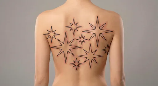
Star motifs read best when each point stays sharp and uncluttered.
Works well for balanced, structured layouts.
- Placement
- Back
- Style
- Fine line
- Motif
- Stars
- Typical size here
- Medium (8–14 cm)
- Visibility
- Subtle — usually covered by clothing
- Line weight
- light
Download files for this design are not available yet. Save the preview and use the notes below when you brief an artist.
On the back
Because the back is broader, clear shapes and consistent line weight help the design stay readable. Symmetry tends to look clean here, but slight asymmetry can work if the main axis stays centered and the edges remain open.
Works well for balanced, structured layouts.
Fine line linework
Because the lines are thin, scale and spacing matter more than shading. Clean silhouettes, gentle arcs, and soft symmetry help the design read well from a few feet away without needing extra weight. This makes fine line a good fit for curated, placement-first layouts.
Works well with gentle curves and clean silhouettes.
The stars motif
A single star stays crisp at small sizes, while a short cluster can add movement without overwhelming the placement. Use consistent spacing and avoid tiny overlapping points so the motif remains legible as it settles and heals.